The Effect of Lighting the Buildings on the Perception of People from the Color Temperature of Light
Received: 28-Nov-2017 / Accepted Date: 08-Jan-2018 / Published Date: 20-Jan-2018 DOI: 10.4172/2168-9717.1000211
Abstract
Considering the exclusive position of lighting in life and especially in the night lives of towns, presenting some principles to optimize the lighting procedures of contemporary buildings and historical edifices are of utmost importance in urban matters. There are several standards for colors and lights to be used in the interiors of buildings, but not so many principles can be found for the exteriors and facades of buildings. Moreover, in the lighting of buildings, mostly matters such as functionality, aesthetics, and security issues have been taken into account while issues such as optimum energy use and visual perception have been neglected. In the present study, the above mentioned matters as well as the sense of relief induced by the lighting and its colors have been investigated; the latter point brings about reduced energy use in different seasons. The respondents in this study did not regard the temperature of the colors and answered the questionnaire according to the feelings they got from the colors. The results show that individuals get a feeling of warmth from colors such as white, red, orange, and yellow; this finding can be used to change the lighting of buildings to warm colors throughout cold seasons. Furthermore, the respondents reported a feeling of cold from colors like cold white, blue, and purple; accordingly, this finding can be used in warm seasons, especially in areas with hot and dry weather. The application of cold colors in such areas can reduce the amount of used energy. In addition, in order to apply a lighting project and use the facilities of artificial lighting, one must acquire the required knowledge of its technicalities and facilities; then, these facilities are to be evaluated through technical factors so that a proper optimized pattern for providing aesthetics as well as visual relief along with reduced energy use can be proposed.
Keywords: Color temperature; Optimization of energy use; Effect of lighting colors
Introduction
At first, the literature review of the subject, especially on the sense of relief induced by color temperature and its effects on individuals was investigated through library resources. It is important to understand how our brains process and integrate multisensory information in order to achieve optimal performance. Since factors related to this subject were diverse and most of them were not directly related to the main purpose of the study, which is reducing energy use, only the aforementioned factors were investigated. Then, using resources such as books, articles, theses, and websites, the history of this subject and the works of other authors were analyzed.
The subject was turned into a research through stating goals and proposing questions and hypotheses. Second, a questionnaire was set according to the lighting of a case on the exterior. The respondents were divided into two groups: the first was an expert group which consisted of B.A. and M.A. students of architecture of Qom University; the second was a general group with ordinary respondents. Then, the average of the scores of the questionnaire was calculated in such a way that 5 was for very warm, 4 for warm, 3 for average, 2 for cold, and 1 for very cold (Table 1). The color white with a temperature of 3500 K is known as cold white and the color white with a temperature of 2700 K is known as warm white. Colors below warm white are yellow, orange, and red; colors above cold white are blue and purple. Data analysis shows that the respondents have not paid attention to the temperature of the colors and have answered only according to the colors themselves. For example, they felt very warm with red and very cold with blue and purple [1,2].
| Very warm | Warm | Medium | Cold | Very cold | |
|---|---|---|---|---|---|
| Score | 5 | 4 | 3 | 2 | 1 |
Table 1: Different lighting and color temperatures.
Theoretical foundations
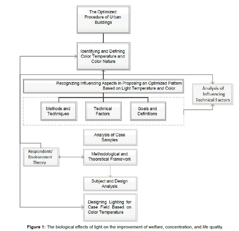
Considering the above mentioned information on the lighting of buildings and through analyzing certain cases in some areas, it can be concluded that the lighting of buildings at night is a matter of importance; moreover, using the triple natures of lighting, this achievement can be facilitated. It should be mentioned that of the triple natures, only the third one is focused upon in the present study: the biological effects of light on the improvement of welfare, concentration, and life quality (Figure 1).
Color temperature
Color is produced by lighted waves and is a special sort of electromagnetic energy. Color can be described via three variables of hue, lightness, and saturation. The description of a color is usually given to distinguish it from other forms of the same color. For example, different shades of red are caused by different light and dark tones of the color red; moreover, the degree of a color being matte or transparent is defined via saturation (Chart 1). Each color has its own specific wavelength. If only short wavelengths, between 400 and 500 mill microns, are perceived by eye nerves, the color blue will be seen [3].
A surface is seen as blue because it only reflects wavelengths between 400 and 500 millimicron and absorbs or repulses other wavelengths (Figure 2). When we look at a white surface, we perceive it as white because its surface reflects all visible wavelengths to our eye, and the visible wavelengths are present with almost equal proportions [4]. If we pick only one or a few visible wavelengths and flash them on a white surface, the surface reflects the same color only. The white surface is the reflection agent. On the other hand, if we subject a black surface to light, the surface is perceived as black at both stages. In fact, the black surface is an absorption agent. Now, if a red surface is subjected to light, it is perceived as red only if the flashed light includes a red wavelength. Otherwise, it will be perceived as black. Thus, color does not exist in objects themselves but it is the result of the reflection or absorption of visible wavelengths on the surfaces of objects, which also depends on the reflection or absorption of light and the effect of the mixture of origin’s wavelength with the surface of an object” [5]. In the figure below, a surface with different colors is put under the colored lights of LED-EGB lights. It can be seen that when a wavelength needed for a color, for example red, is not present, the red parts of the surface are seen as black (Figure 3).
CIE
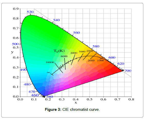
In general, the main colors found on the main spectra are defined via words like red, yellow, blue, etc.; in addition, colors produced through the mixture of other colors are defined via words like pale pink, greenish blue, etc. This sort of categorizing is usually vague and is subjective, that is, it differs from person to person. Due to this, the lightness of a color is not usually mentioned in scientific application. Nowadays, a numerical system called CIE Chromaticity system is used. In this system, every color can be identified with a number. These numbers are assigned according to light spectral distribution, and therefore, no distinct theory is involved [5]. In this three-dimensional system, the values of horizontal and vertical lines of X and Y are presented on a CIE Chromatist curve to show colors. Chromatist curve is a curve for determining the color of a light on X and Y axes. After reaching its stable state, the color of each light issued from a given lamp can be determined using this curve. In this curve, the geometrical position of black object radiator is also shown, which ranges from a red to a blue part; it is also presented with its color temperature on Kelvin scale [6]. In addition to determining the coordinates of colors, the Chromaticity curve also shows the dominant wavelength of a color. Standard colors are in the outer borders of the curve, and as we move toward the center, the saturation is reduced (Figure 4) [7].
Sampling method and sample volume
The sampling was done through targeted random sampling. Considering the studies, 70 individuals were chosen for sampling. Finally 65 samples were decided on out of those 70 individuals, and 45 individuals were ordinary people while 19 were experts [8].
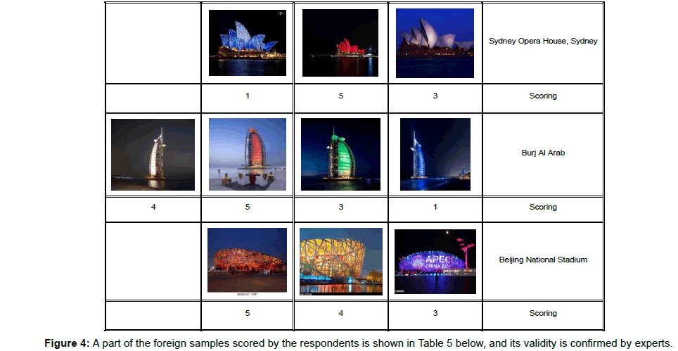
In the data collection, a questionnaire was given to the respondents. In this questionnaire, 35 famous edifices throughout the world, each with different lighting and color temperatures were presented [9]. The respondents were asked to score, according to Table 1 the feeling they got from these presentations. If they got a very warm feeling, they scored 5 and if very cold, 1.
Data analysis
The data collected from the evaluations were analyzed through statistical package for social sciences (SPSS, version 21, Chicago IL, USA) [10]. The analyses are presented through frequency tables, descriptive statistics, and comparisons of the averages of two independent groups. The correlations of the two groups of colors are also presented. The average age range of the ordinary respondents was between 25 and 45. The respondents were from the city of Qom since the case study of the building is in that city. The expert respondents were also from B.A. and M.A. students of Qom Azad University, their ages ranged from 20 to 25. All had normal color vision [11,12].
Frequency analysis
According to Table 2 the whole statistical population of the study consists of 45 ordinary and 19 expert respondents.
| Percentage | Frequency | Groups |
|---|---|---|
| 68 | 41 | Ordinary Respondents |
| 31 | 19 | Expert Respondents |
| 100 | 60 | Overall |
Table 2: Data analysis.
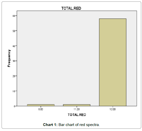
Based on the study of the history of the subject, that the color red gives a feeling of warmth (from 1 to 5); this hypothesis is confirmed by the fact that most of the respondents scored it either 4 or 5 [13]. This can be seen in Table 3.
| Percentage | Frequency | Overall Score |
|---|---|---|
| 4 | 2 | 11 |
| 96 | 58 | 12 |
| 100 | 60 | Total |
Table 3: Statistical analysis.
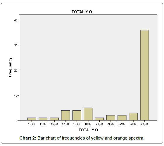
The colors yellow and orange with temperatures between 2000 and 4000 kelvin got scores of either 3 or 4 [14]. Considering Table 4 and the collected data, it shows that 24 pictures with yellow and orange colors and temperatures of 2000 to 4000 kelvin were scored 3 or 4 (Chart 2).
| Percentage | Frequency | Total Score of the Colors Yellow and Orange |
|---|---|---|
| 1 | 1 | 13 |
| 1 | 1 | 14 |
| 1 | 1 | 16 |
| 6 | 4 | 17 |
| 6 | 4 | 18 |
| 8 | 5 | 19 |
| 1 | 1 | 20 |
| 3 | 2 | 21 |
| 3 | 2 | 22 |
| 5 | 3 | 23 |
| 60 | 36 | 24 |
| 100 | 60 | Overall |
Table 4: The frequency table of yellow and orange spectra.
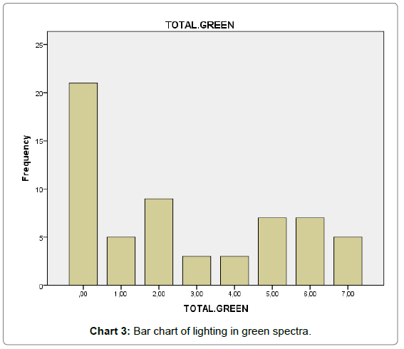
The color green with temperature between 2300 and 4300 kelvin got a score of 3. However, the results showed something different; the color was scored between 2 and 4, which means cold or warm. It is interesting to note that green is warmer than blue and colder than red (Table 5 and Chart 3).
| Percentage | Frequency | The Overall Score of Green in 13 Pictures |
|---|---|---|
| 35 | 21 | 0 |
| 8 | 5 | 1 |
| 15 | 9 | 2 |
| 5 | 3 | 3 |
| 5 | 3 | 4 |
| 11 | 7 | 5 |
| 11 | 7 | 6 |
| 8 | 5 | 7 |
| 100 | 60 | Overall |
Table 5: The frequency table of green spectra.
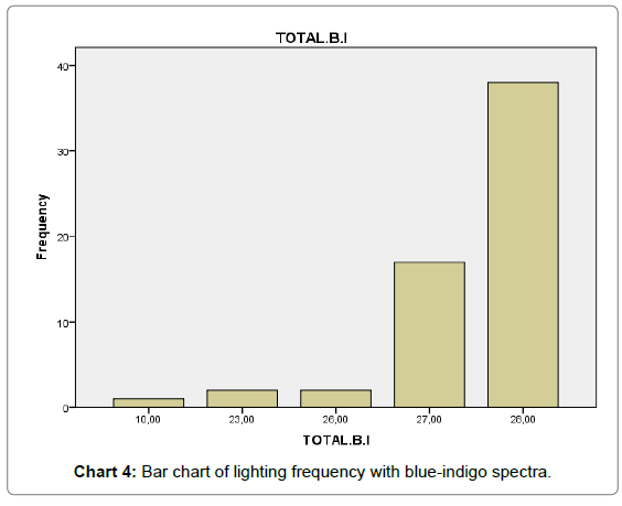
The colors blue and indigo with temperatures between 4700 and 6000 kelvin got scores of either 1 or 2. Considering Table 6 and the collected data, the 28 pictures with blue and indigo colors and temperatures of 4700 to 6000 kelvin were scored 1 or 2 (Chart 4).
| Percentage | Frequency | The Overall Score of Blue and Indigo in 28 Pictures |
|---|---|---|
| 1 | 1 | 10 |
| 3 | 2 | 23 |
| 3 | 2 | 26 |
| 28 | 17 | 27 |
| 63 | 38 | 28 |
| 100 | 60 | Overall |
Table 6: The frequency table of blue-indigo spectra.
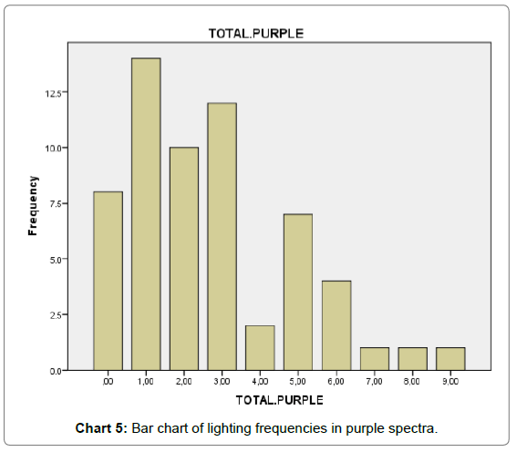
The color purple with a temperature of 8000 kelvin received a score of 3 or 4. However, the results showed something different; the color was scored cold or very cold although the color has the highest temperature (Table 7 and Chart 5).
| Percentage | Frequency | The Overall Score of Purple with 13 Pictures |
|---|---|---|
| 13 | 8 | 0 |
| 23 | 14 | 1 |
| 16 | 10 | 2 |
| 20 | 12 | 3 |
| 3 | 2 | 4 |
| 11 | 7 | 5 |
| 6 | 4 | 6 |
| 1 | 1 | 7 |
| 1 | 1 | 8 |
| 1 | 1 | 9 |
| 100 | 60 | Overall |
Table 7: The frequency table with purple spectra.
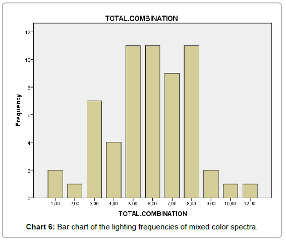
The mixed color, the pictures produced with the mixture of colors in lighting, will be scored as medium. The findings and analyses presented in Table 8 with 13 pictures confirm this prediction; a score of 3 was recorded (Chart 6).
| Percentage | Frequency | The Overall Score of the Mixed Color with 13 Pictures |
|---|---|---|
| 3 | 2 | 1 |
| 1 | 1 | 2 |
| 11 | 7 | 3 |
| 6 | 4 | 4 |
| 18 | 11 | 5 |
| 18 | 11 | 6 |
| 15 | 9 | 7 |
| 18 | 11 | 8 |
| 3 | 2 | 9 |
| 1 | 1 | 10 |
| 1 | 1 | 12 |
| 100 | 60 | Overall |
Table 8: The frequency table with mixed color spectra.
T2-Sample test
Two independent groups were assigned using T2 test. Only in the color green is there a meaningful difference between the opinion of the expert respondents and that of ordinary ones [15]. In other words, the experts, according to theories, had a more correct feeling toward the color than did the ordinary respondents. In other colors, however, no significant differences were observed between the opinions of these groups (Table 9).
| Meaningfulness | Degree of Freedom | t | Standard Deviation | Average | Number | Groups Colors |
|---|---|---|---|---|---|---|
| 00 / 0 | 58 | 5 - | Green | |||
| 2 | 1 | 41 | Public | |||
| 1 | 4 | 19 | Expert |
t: Hotelling's T-square test for two independent samples.
Table 9: Opinion of the expert respondents and that of ordinary ones.
Correlation
The feelings acquired from the colors red, yellow, and orange have a correlation which is identified using the Pearson’s Correlation Analysis [16]. The correlation between red and yellow-orange is meaningful on a scale of 0.01. No correlation is observed among other colors by the respondents. There could be a possible correlation, but the respondents have not sensed it; so it is not possible, for example, to use blue instead of purple [17].
Conclusion
Choosing a suitable color temperature can have considerable effects in aesthetics and the physiological functions of the human body. As is known, one of the most characteristic features of natural light is its consistency and variety through a day, which causes movement and change at different hours. This fact influences the human body, with the sunset and the changing of sunlight to a color with low color temperature, the amount of melatonin (the hormone increasing human consciousness) increases; this substance affects the 24-hour rhythm of the human body. Moreover, lighting in night can disrupt this rhythm and cause problems for people.
This fact is more observable in the color blue and colors near white. So lighting with low color temperature and low intensity can decrease these types of problems; in general, it is suggested monochrome colors and colors with low temperature be used in residential areas. In addition, the choice of a suitable color can enhance the beauty of facades; “the intentional contrast between color lights can be used to emphasize different parts of a building” (N. A. Smith). Moreover, choosing a color temperature for each material is different. For example, low color temperature is more suitable for those materials that have warm colors, like brick and wood. The results of this study show that respondents got a feeling of warmth with colors that have a low temperature. This finding can be used in the lightings of cities with dry and hot weather like Qom, which has hot summers and cold winters. Furthermore, in order to make the environment cooler, cold colors like blue and purple can be used in lighting.
References
- Berry PC (1961) Effect of colored illumination upon perceived temperature. Journal of Applied Psychology 45: 248.
- Hardin CL (2000) Red and yellow, green and blue, warm and cool. Explaining color appearance Journal of Consciousness Studies 7: 113-122.
- Wright B (1962) The influence of hue, lightness, and saturation on apparent warmth and weight. The American Journal of Psychology 75: 232-241.
- Michael GA, Rolhion P (2008) Cool colors: Color-induced nasal thermal sensations. Neuroscience Letters 436: 141-144.
- Michael GA, Galich H, Relland S, Prud’hon S (2010) Hot colors: The nature and specificity of color-induced nasal thermal sensations. Behavioural brain research 207: 418-428.
- Scuello M, Abramov I, Gordon J, Weintraub S (2004) Museum lighting: Optimizing the illuminant. Color Research & Application 29: 121-127.
- Matsubara N, Gassho A, Kurazumi Y (2004) Facilitatory effects of environmental sounds on hue-heat phenomena. In 18th Int Congr Acoust 2: 1775-1778.
- Fulmek P, Sommer C, Hartmann P, Wenzl FP, Pachler P, et al. (2012) Color temperature constancy of phosphor converted LED modules: A combined thermal and optical simulation study on the materials requirements. E & I Â Electrical and Computer Engineering, pp: 1-5.
- Scuello MI, Abramov J, Gordon, Weintraub S (2004) Museum lighting: Optimizing the illuminants Color Research & Application 29: 121-127.
- Weintraub S (2000) The Color of White: Is there a ‘Preferred’Color Temperature for the Exhibition of Works of Art? Western Association for Art Conservation Newsletter 21(3).
- Katoh N, Nakabayashi K (2001) Applying mixed adaptation to various chromatic adaptation transformation (CAT) models. In PICS, pp: 299-305.
- (2004) International Commission on Illumination, Technical Committee TC 3-22" Museum Lighting" Control of Damage to Museum Objects by Optical Radiation. Commission internationale de l'eclairage.
- Lang PJ (2005) International affective picture system (IAPS): Affective ratings of pictures and instruction manual. Technical report.
- Janssen TJWM, Blommaert FJJ (1997) Image quality semantics. Journal of imaging science and Technology 41(5): 555-560.
- Fenko A, Schifferstein HN, Hekkert P (2010) Looking hot or feeling hot: What determines the product experience of warmth? Materials & Design 31: 1325-1331.
- Ho HN, Van Doorn GH, Kawabe T, Watanabe J, Spence C (2014) Colour-temperature correspondences: when reactions to thermal stimuli are influenced by colour. PloS One 9.
Citation: Fakhr BV, Mahdavinejad MJ (2018) The Effect of Lighting the Buildings on the Perception of People from the Color Temperature of Light. J Archit Eng Tech 6: 211. DOI: 10.4172/2168-9717.1000211
Copyright: © 2018 Fakhr BV, et al. This is an open-access article distributed under the terms of the Creative Commons Attribution License, which permits unrestricted use, distribution, and reproduction in any medium, provided the original author and source are credited.
Share This Article
Recommended Journals
Open Access Journals
Article Tools
Article Usage
- Total views: 5581
- [From(publication date): 0-2018 - Apr 01, 2025]
- Breakdown by view type
- HTML page views: 4741
- PDF downloads: 840

